Android Tutorial: Creating Buttons That Appear Conditionally on Scroll
ProfilePicture of Aris Papadopoulo
Aris Papadopoulo
Android Software Engineer
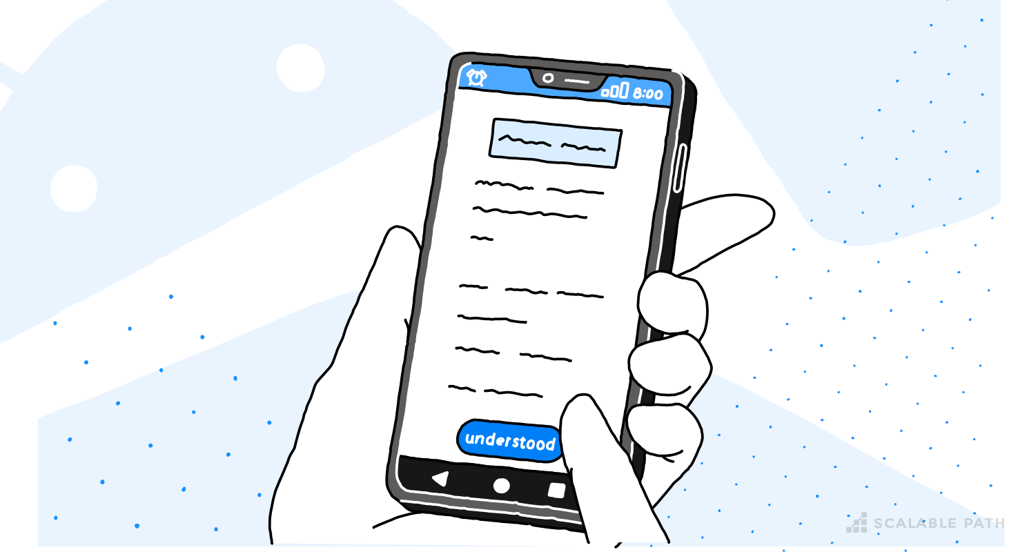
Android app with a button of the bottom of the screen

Imagine you’re scrolling down a very long screen (this is a common situation with Privacy Policies). As you scroll down the ‘Accept’ button scrolls off the screen. This is a short but helpful Android Tutorial for fixing this UX problem.

I will show you how to place the button in an alternative position: the bottom of the screen. When the original button reappears, the button at the bottom should disappear (which means that you should never have both buttons visible on the screen).

The support library provides us with two components that are very useful for this Android tutorial:

The button at the bottom of the screen can be implemented with the help of a Bottom Sheet component.

For identifying the scrolling behavior and triggering the appearance of the Bottom Sheet, we can use a Coordinator Layout.

Android Authority has published two quite helpful tutorials, with source code on Github for these two components:

- Bottom Sheets

Coordinator Layout

So, the first step is quite straightforward: add the button at the bottom as a Bottom Sheet.

1<?xml version="1.0" encoding="utf-8"?>
2<android.support.design.widget.CoordinatorLayout
3 xmlns:android="http://schemas.android.com/apk/res/android"
4 xmlns:app="http://schemas.android.com/apk/res-auto"
5 android:layout_width="match_parent"
6 android:layout_height="match_parent">
7
8
9 <ScrollView
10 android:id="@+id/scroll_view"
11 android:layout_width="match_parent"
12 android:layout_height="match_parent"
13 app:layout_behavior="@string/appbar_scrolling_view_behavior">
14
15 <LinearLayout
16 android:id="@+id/c"
17 android:layout_width="match_parent"
18 android:layout_height="wrap_content"
19 android:gravity="center_horizontal"
20 android:orientation="vertical"
21 android:paddingBottom="70dp"
22 android:paddingLeft="32dp"
23 android:paddingRight="32dp"
24 android:paddingTop="20dp">
25
26 <TextView
27 android:layout_marginTop="16dp"
28 android:text="@string/privacy_header_1"
29 style="@style/header"/>
30
31 <TextView
32 style="@style/privacy_text"
33 android:layout_marginTop="29dp"
34 android:text="@string/privacy_text"/>
35
36 <Button
37 android:id="@+id/got_it"
38 android:layout_width="160dp"
39 android:layout_height="50dp"
40 android:layout_marginTop="29dp"
41 android:text="@string/understood"
42 android:background="@drawable/rounded_button"
43 android:textAppearance="@style/rounded_button_text"/>
44
45
46 <TextView
47 style="@style/header"
48 android:layout_marginTop="48dp"
49 android:text="@string/privacy_header_2"/>
50
51
52 <TextView
53 android:id="@+id/long_long_text"
54 style="@style/privacy_text"
55 android:layout_marginTop="23dp"
56 android:text="@string/long_text"/>
57
58 </LinearLayout>
59 </ScrollView>
60
61 <FrameLayout
62 android:id="@+id/bottom_sheet"
63 android:layout_width="match_parent"
64 android:layout_height="wrap_content"
65 app:behavior_hideable="true"
66 app:layout_behavior="android.support.design.widget.BottomSheetBehavior">
67
68 <Button
69 android:id="@+id/bottom_button"
70 android:layout_width="match_parent"
71 android:layout_height="50dp"
72 android:background="@color/colorPrimary"
73 android:text="@string/understood"
74 android:textAppearance="@style/rounded_button_text"/>
75 </FrameLayout>
76
77</android.support.design.widget.CoordinatorLayout>
78
79

The layout consists of a CoordinatorLayout that has two children: a ScrollView with the scrollable content and a FrameLayout with the bottom button. We can now manually show/hide the bottom sheet by calling

1bottomSheetBehavior.setState(BottomSheetBehavior.STATE_EXPANDED)
2

or

1bottomSheetBehavior.setState(BottomSheetBehavior.STATE_HIDDEN).
2

But of course we don’t want to bring the Bottom Sheet up manually, we want it to appear automatically when the rounded button disappears off the screen. The second tutorial of Android Authority that we have linked above demonstrates in case 4, how we can implement a custom behavior and alter a view’s attributes when another widget goes off the screen.
So we could implement a custom CoordinatorLayout.Behavior following the tutorial, and, instead of toggling the button’s child, set the Bottom sheet’s state to expanded.

But, wait… then we would have to add this custom CoordinatorLayout.Behavior to the bottom_sheet FrameLayout, but this already has a coordinator layout set. And we can’t add two behaviors.

The solution is simple. We just need to extend the BottomSheetBehavior as in the snippet below: (we don’t even have to resort to a Decorator — simple inheritance works).

1package app.we.go.bottombutton;
2
3import android.content.Context;
4import android.support.design.widget.BottomSheetBehavior;
5import android.support.design.widget.CoordinatorLayout;
6import android.util.AttributeSet;
7import android.util.Log;
8import android.view.View;
9import android.widget.FrameLayout;
10
11/**
12 * {@link BottomSheetBehavior} that shows automatically when the dependency goes out of the screen
13 * and hides when it comes back in.
14 */
15
16public class OutOfScreenBottomSheetBehavior extends BottomSheetBehavior<FrameLayout> {
17
18 private int statusBarHeight;
19
20 public OutOfScreenBottomSheetBehavior(Context context, AttributeSet attrs) {
21 super(context, attrs);
22
23 int resourceId = context.getResources().getIdentifier("status_bar_height", "dimen", "android");
24 if (resourceId > 0) {
25 statusBarHeight = context.getResources().getDimensionPixelSize(resourceId);
26 }
27 }
28
29 @Override
30 public boolean layoutDependsOn(CoordinatorLayout parent, FrameLayout child, View dependency) {
31 return dependency.getId() == R.id.behavior_dependency;
32 }
33
34 @Override
35 public boolean onDependentViewChanged(CoordinatorLayout parent, FrameLayout child, View dependency) {
36 int[] dependencyLocation = new int[2];
37
38 dependency.getLocationInWindow(dependencyLocation);
39 Log.d("BEHAVIOR", "Location: " + dependencyLocation[1]);
40
41 if (dependencyLocation[1] <= statusBarHeight) {
42 if (getState() != STATE_EXPANDED) {
43 setState(STATE_EXPANDED);
44 }
45 } else {
46 setState(STATE_HIDDEN);
47 }
48 return false;
49 }
50
51}
52

The implementation is really simple, we just get the position of the coordinator’s dependency, and as soon as it hides behind the status bar, we set the state to STATE_EXPANDED by calling the parent’s setState method.

A few notes about the code above:

  • The code uses a somewhat unsafe method of calculating the status bar’s height. There are countless questions on StackOverflow about how to get the status bar’s height. I consider this to be the cleaner one. If you want to avoid it, you might be tempted to just trigger the action when the y-location of the dependency on screen is 0. Keep in mind though that if your status bar is not translucent, the position will never be 0.
  • For all this to work, there is a small addition that we need to do to the layout code in order for the whole thing to work.
1<?xml version="1.0" encoding="utf-8"?>
2<android.support.design.widget.CoordinatorLayout
3 xmlns:android="http://schemas.android.com/apk/res/android"
4 xmlns:app="http://schemas.android.com/apk/res-auto"
5 android:layout_width="match_parent"
6 android:layout_height="match_parent">
7
8 <!-- The Scroll View as before, but we are ommiting it... -->
9
10 <FrameLayout
11 android:id="@+id/bottom_sheet"
12 android:layout_width="match_parent"
13 android:layout_height="wrap_content"
14 app:behavior_hideable="true"
15 app:layout_behavior="app.we.go.bottombutton.OutOfScreenBottomSheetBehavior">
16
17 <Button
18 android:id="@+id/bottom_button"
19 android:layout_width="match_parent"
20 android:layout_height="50dp"
21 android:background="@color/colorPrimary"
22 android:text="@string/understood"
23 android:textAppearance="@style/rounded_button_text"/>
24 </FrameLayout>
25
26 <!-- This view serves as the dependency of the of the OutOfScreenBottomSheetBehavior
27 (it has to be a direct child of the CoordinatorLayout) -->
28 <View
29 android:id="@+id/behavior_dependency"
30 android:layout_width="0dp"
31 android:layout_height="0dp"
32 app:layout_anchor="@id/got_it"
33 app:layout_anchorGravity="bottom"/>
34
35</android.support.design.widget.CoordinatorLayout>
36
37

The CoordinatorLayout only “coordinates” its direct children, so we can’t actually make the behavior directly depend on the rounded_button. The trick to overcoming this limitation is to add the dummy View behavior_dependency, which is anchored to the rounded_button and so moves in sync with it, and then use this view as the dependency view in our Custom behavior. Check out the full source code from this Android tutorial on Github.

If you are looking for more content for Android developers, we created an article about the most common Android app architectures and which one Google recommends. Also, we analyze the advantages of using Kotlin vs Java for Android development.


Looking to hire?

Join our newsletter

Join thousands of subscribers already getting our original articles about software design and development. You will not receive any spam, just great content once a month.


Read Next

Browse Our Blog